Recently, our discussions have leaned towards affordance and learning in users. During my presentation on making users learn, I heard a very good point from the audience that really hit home from me. That point was the subtle, very subtle differences in controllers.
As a gamer, I don’t restrict myself to one console but instead play a variety of games on a variety of platforms. As a result, I’m used to switching between game scenarios as well as control schemes on the fly. A common transition for me is between playing games on the Sony Playstation and Microsoft’s Xbox systems (of course in this example I’m referring to the PS3 and Xbox 360)
Now let’s take a look at a side by side comparison of the Xbox 360 and PS3 controllers.
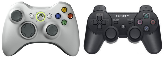
Xbox 360 on left, PS3 on Right
There are clearly a lot of similarities between the two controllers. First off they share the same schema of having two analog sticks and a d-pad, albeit they’re positioned differently on the controllers. There are also four face buttons, a select, start and a home button (shaped like an X for the 360 and the PS logo for the PS3). While not visible in this image, both controllers also have a set of four shoulder buttons.
Now as someone who’s played a lot of games, it’s generally very easy for me to pick up a 360 controller or a PS3 controller and acclimate to the slightly different positioning of buttons and analog sticks. The real problem with these differing control schemes though is not the placement of control elements but the way they’re labeled.
On the Playstation the face buttons are labeled X, Square, Triangle and Circle. On the 360 they are labeled (in the same order counter to the PS3) A, X, Y and B. This really isn’t an issue unless you’re actually playing a game that starts yelling Quick Time Events at you where you have to rapidly press a sequence of buttons. Now I mostly play PS3 games, so when a game tells me I need to mash a sequence of buttons on the PS3 I can usually handle that pretty well. But with the same scenario on the 360 I find myself fumbling because I’m used to the placement of the PS3 controllers! So when I’m asked to press A, there’s a disconnect in my brain because my hands are in the optimal position for Playstation but my brain is trying to translate that into 360 controls.

X on the PS3 controller is in a completely different place than the 360!

The X on the 360 is where Square normally is! Agh!
The same problem arises with the shoulder buttons. The PS3 uses R1, R2 to denote the right two shoulder buttons front and back while L1 and L2 represent the left two shoulder buttons. The 360 however uses RB and RT and LB and LT for its shoulder buttons.
This isn’t necessarily Microsoft and Sony’s fault. It’s a fact that different companies with different products will strive to create diversity and cater to their own consoles’ needs. Just like there is no singular beat-all interface, there is no single beat-all controller scheme. At least in the case of Sony and Microsoft there isn’t too huge of a difference. A normal gamer can still switch between the two consoles pretty seamlessly and there is a lot of overlap.
Not like some other controllers!!

The WiiU’s gamepad controller!
To be continued in Part 2!!


